Showing posts with label Research and Planning. Show all posts

Wednesday, 12 October 2011

MAGAZINE AD. ANALYSIS 3

The Stone Roses Magazine Advert.


This advert is alot different from the previous two I have analysised. The first and most obvious variation is the layout and font styles. The title is positioned in the centre of the page, and is incorperated into the image. The mixture of font and the photograph of the orange slice works well linking the image to the title, using an orange creates an element of disjuncture, showing no obvious links between orange and content of the album. I really like the concept of using an object inplace of a letter, other example fo this could be an eyeball as an 'o', or other roudn object or tree in place of an 'l' etc. These two examples are more suited to the electronic genre we have picked. The red white and blue baint stripes towards the left side of the page tie in the red, white and blue font colours used at the bottom, ensuring that the colours are used in two seperate areas makes the advert work as a whole linking all elements together. The white 'paint' bubble creates a blank section is which text can be writen clearly, using this shape as a text box works well in this advert as is the paint splattered background links to the text box shape again tying all elements together.

The fonts used throughout are clear and simple a contrast to the busy image and backdrop. Ensuring the font is kept simple is vital for the reader to be able to take note of the information given to them on the page. I will ensure that on my advert all information is clear, consise and easy to read. On the above page the date of release isn't written in number format but written as 'OUT NOW', I think this text could be a little bigger as it's not that noticeable for the reader. By using the logos of the sites the album is available on shows the authenticity of the release and shows where the reader can go to to purchase it.
In my personal opinion there is a little too much text on this page, slightly cluttering the advert. The repetition of 'Re;' is keeps a motif going across the page, causing the words to stay in the mind of the reader. I like the idea of including authentic logos of where the  album is available, however I feel the text box is a little excessive. In this case as the band is so well known people would take the time read the information given, but in the case of the band that we are creating, it would be not very well known so people would glance at the page and take in quick bursts of information, for example band name, album title and release date.

I prefer an album cover that uses an actual photograph, however this effect works well for the band shown. The paint, badges and orange show elements of disjuncture which work well with the genre of the band. Using the badges to contain quotes from magazines such as 'Q' link together the image and album. I think this is a good technique to use as it incorporates all parts of the advert, keeping the quotes subtle also makes the band not seem 'big headed' as they are shouting about their achievments.

MAGAZINE AD. ANALYSIS 2

FOALS Magazine Analysis

 This magazine advert is for the release of Foals Total Life Forever album. Using Gold lettering as apposed to their regular white text implies a a special edition album release. This would be correct as it's a Limited Edition Box set. Again the font positioning is at the top and bottom sections, I positioning I would ideally like to use, allowing for the middle section to be used for the main image. The sizing of the lettering works well gradually shrinking, allowing for more text to be added. The lines added keep the advert neat and organised, similar to the 'Florence and the Machine' ad, in my opinion a simple advert is much more effective. The use of a release date written in number format creates a more dramatic vibe to the advert. This feel creates a hype around the release of the album, getting more interest resulting in a higher download number. The font used is a trademark of the bands title, having always been used in their albums, posters and adverts. This allows fans to immedietly recognise which band is being advertised, as they would recognise their trademark font.

 The main image is an underwater photograph, highly detailed yet no obvious link to the band. This disjuncture does suit their genre as they have a dreamy, unique sound a disjuncture I would like to recreate on my ad. The detailing in the picture is alot higher than I would like to include as I think it could easily become 'cluttered'. Also it's a landscape shot, I would like to use a blank background and use one or both of the band members. Using this dark mise en scene allows for the text to standout, using a dark colour pallette works well keeping it simple and effective. The image used shows inspiration from the famous 'Nivarna' cover of the underwater baby and dollar bill. i think taking inspiration from other album covers works well as it allows recognistion from people who are perhaps not fans or not heard of our band 'PASSONFONTAINE'. I would liek to take inspiration from the vampire weekend album covers, the covers are simple but show real photographs, an element I would like to use.  

Tuesday, 11 October 2011

MAGAZINE AD. ANALYSIS

Florence & the Machine - LUNGS


It was difficult to find any magazine adverts to analyise online, therefore the advert above may not be to the exact style and genre of the one I would like to create. The font and text positioning is however, the position I would use, the band name at the top and other information in the lower third works well as it allows a large portion of the page to be spcifically for the image. Using a white font is also a factor I would like to include, I think it contrasts well against the dark backdrop. I think the concept of using a numbver date works really well, it gives a dramatic effect to the advert, as if it is a major event. Using simplictic language, with minimal writing keeps the page organised an un-cluttered, a factor with I think is very important. It's easy to read and the viewer can get the information easily and quickly.
The main image of Florence Welsh works well and suits the genre and content of songs on the album, her pose is natural and having her not looking at the camera works well as the photograph does not look forced. The real lungs placed over her torso represent not only the actual name of the album, but the dark side of her lyrics. The colour scheme used works well, the colours are muted, with black being the main tone used, this ensures the text is very visible and the highlights in the photograph stand out making the image look clear. The floaty dress and roses in the background, create a binary opposite to the raw lungs in the centre, showing both sides to the content of her songs.

Thursday, 6 October 2011

MOCK UPS


Above is a mock i've created using photoshop. The image was sourced from the internet and I have edited it further. Colour wise I think the vibrancy and high contrast works well, creating an almost psychedelic feel to the image, this would represent the genre well. The content of image also links to our music video storyline, the characters will be wearing masks/ headresses similar to the paper bags used in this photo. The font positioning and style are similar to that of the 'Foals' albums. I prefer white fonts as they are easy to see and read against the coloured background. To create a more personalized lettering style I have used a space between each letter, I feel that this works well, giving the cover a finishing touch.  The cover below is basically the same however I have edited a different photograph.                                                                      
 The covers below are create using the same concept, however I have altered the lettering position. I like this font position equally as I think it creates a formality to the cover. The font position I choose to use will depend solely on the image contents layout. This photograph below's colours have been altered to look as if they're unattural, I'm fond of this style as it would suit the genre and overall image of the band. Both images are grainy, creating an almost vintage look, this combined with either the masks or vibrant colour or both combined will create a binary opposit of vintage and modern.

Ideas- Album Cover

Just to get an idea of what I may want my album cover to look like, I have very quickly created a few mock ups in Photoshop using photos from the internet and adding the band name in an attempt to create something similar to album artwork. 


I firstly create a quick mock up taking inspiration from albums such as James Blakes and The Horrors. This mean taking an image and adding a blur motion to create the effect shown above. This is something I am very fond on and will consider once editing my own photos. I have kept the writing on the cover to a minimal, just exposing the band name, this font was just something to play around with, therefore fonts are something I am going to consider depending on how 'busy' my image is.

Secondly, I have taken an image which contains masks. As we are making good use of masks throughout our music videos, this is something I will definitely be considering when creating my own digipack. Additionally, there is a slightly different effect of blur motion used on the image to create a completely different effect to the one above. I like the idea of incorporating the masks and blur motion into one image but this is something I will have to test after taking my own photos. Even though I have only used a very simplistic font, which acts as a caption for the image, when accompanying an image as busy as this, I believe it works fairly well.  

Wednesday, 5 October 2011

Album Artwork Analysis- CRYSTAL CASTLES


This is the first album that the electronica duo 'Crystal Castles' released. Above is an image of the album artwork itself. The presenting image itself could be described as having a somewhat 'lifeless' nature as a result of the expressionless body language and non existent facial elements. Taking a glance at the image it looks slightly bland but once each segment of the image is taken into more detail we can understand that the photo itself has more of an explanation to it than many would first believe. The main image at a close glance can be recognised as three separate images incorporated into each other which has therefore resulted in the effect we could call 'playing with the eyes', and this is something that links in superbly with their music genre. The bouncy, electronic sound that the band create is also sometimes a question to the ears and this has therefore taken place and been continued into the album artwork. 
The two band members featured in the image have mimicked one another in their expression which shows the similarity between the two and links them both together but this could also be contrasted by the simple fact that they are gender opposites and the male artist is a clearly a fraction larger than Alice Glass. By doing this, the cover has ensured that there isn't too much going on on top of the background image which carries an interesting pattern in itself. The two stood in a mid shot looking fairly lifeless is something that has come together to work well. The reason that I feel this image has work is due to the stereotype of electronica being 'hidden'. As many electronic artist/dj's have been known to hide their identity as a part of their image, the duo have sustained this role, but added their own twist through body language rather than being masked or completely hidden. 
The colours used have been kept fairly monotone and dark. I believe this is once again upholding the image of electronica which is often a use of dark colours. For example in contrast, on the front of a Pop album cover, colours such as pinks and oranges may be expected. The general layout of the art has been kept minimalistic. The typical title of the band/album is central at the top of the piece is very ordinary which is contrasted well by the odd persona of the photo and therefore this is a great mix. The doubling affect that the title itself holds adds a sense of continuity through the cover as we see a mimic taking place from the artists as well as the background being taken and use several times to create the one piece. 
To conclude, I again feel that this cover works well in its own genre. The idea of a effortless and minimal edited image that does in fact speak a lot is something that I am keen on. Something I probably wouldn't follow the convention of is the title. When creating my own album artwork I hope to make the image the main focus of the page whilst the title itself is something that does not feature largely. 

Tuesday, 4 October 2011

Album Artwork Analysis- THE HORRORS


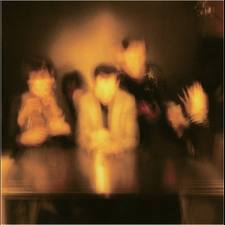
This album 'Primary Colours' which was released by The Horrors earlier this year has artwork that I am hugely fond of. The distorted, unfocused, 'firey' snap that features on the cover influences and mysterious and slightly 'murky' feel to the band and the secrets behind the album itself. Taking the band name itself into context; 'The Horrors' immediately connotes something quite scary or what we would to consider to be unpleasant. Linking this theory into the image itself, the dark and slightly 'ghost like' and abstract vibe is something that is easily traceable throughout the photo, underneath the first glance of what we appear to be simplicity. 
The layout of the album art cover is minimal which is another aspect of the piece I am particularly fond of. As the name of the album let a lone the artist isn't displayed, this once again creates the idea of mystery which when incorporating all the factors together, seems to be creating a sense of continuity. Another feature we could compare this to is the band themselves, due to their lyrical genre fitting in perfectly with the 'indie' scene, stereotypically the band members themselves are gloomy and carry that slightly 'dark' image. Next, the fiery colour scheme which is highlighted as a result of the dark surroundings of the image creates the idea of fire or melting. When taking the orangey colour scheme to match the distortion of the photo itself, this could be portrayed as a 'warm' and welcoming image considering the darkness behind it. 
Something that I personally enjoy when taking a glance at this cover is the idea of feeling that the identities captured in the image have been hidden or are not even there at all. If I was to follow in similar footsteps to this album I would also be creating a sense of continuity as I have incorporated the idea of missing identity into our music video. Although, some may feel there is a lack of writing on the cover this is something I feel does work, but in contrast to this, when creating my own piece, I will aim to add a simplistic style of writing to publish the bands name and depending how busy the image is, album name too.  


Album Cover- Ideas


I came across the image above on weheartit.com, the image itself is surreal and interesting, matching our genre well. Having an element of explicit imagery (the naked torso's) adds interest and compliments our bands persona of being a little 'off the rails' and would appeal to our audience/target age range, almost rebelling against the conventional music genres and albums artworks. The use of the two deer head masks are inkeeping with the record as they relate to the characters we will be using in our music video. The video itself is an example od disjuncture and surrealism, with no obvious link to the lyrics of the song with this image also being an example of both of these. 


Above is a quick mock-up I created using photoshop displaying what kind of style of digi pack I would, ideally, want to make. The photograph itself would not be sourced from the internet but I will have taken one myself. To acheive the correct shot I will need to take many photographs in order to find one which displays the correct vibe. Iy the shot contains models I would prefer the poses to be natural and the 'costume' to be surreal creating a binary opposite of surreal and reality within the photograph. If, however, I do not use people in shot, I want to take a photograph of something completely everyday, perhaps an open fridge, supermarlet isle or plant for example. I would then add an abstract twist to the shot using photoshop, similar too James Blakes blurred face on his album cover.

< Here I have recreated the Vempire Weekends self titled album, again the photograph was sourced from the internet and I have just added some simple text, however I think the simplicity can be very effective. I am not particularly fond of this example but the idea is basically the same as the mock up above, although this time I have used Paint instead of Photoshop where very little accuracy is available.

Album Artwork Inspiration

I have chosen to use this Foals 'Antidotes' CD front cover as something that I may find inspirational throughout the process of creating my own digipack. When taking a first glance at this artwork it is something that strikes me as slightly unusual but in addition, simple yet affective which is a style I think I may be possibly aiming towards. The ever so simple sketch which is located central of the cover is amplified by the colourful mesh of colours 'rammed' into the mouth which adds a slightly odd feel to the cover all of a sudden. The simplistic 'handwritten' style of the band name and album itself is something I am very fond of.


Although this isn't an official album cover created by the 'Yeah Yeah Yeahs' this featured as the artwork on the single release of 'Zero'. Once again taking the simplistic idea and turning it into something slightly fascinating and out of the ordinary is what I enjoy about this work. Using a normal aspect such as a pair of lips and turning the image into an interesting focus with the addition of an eyeball which a pattern has also been incorporated to add to the abnormality a touch more. Relating this to my own genre of electronica is something that would work if I was to create something similar, as in relation, the Yeah Yeah Yeah's are a band which have previously created music with electronic features and styles. 

Friday, 30 September 2011

Risk Assesment

When we are in the process of filming our music v(ideo there will be many risks attached to the task itself. These risks will vary from the location, to the props that we use in the video. 


1. Tripping over location objects
Severity: Medium 
Likelihood: Medium 
Precautions to be taken: All crew and cast need to be aware of the surroundings they are in and be aware of any dangerous object which are in the natural location.  To reduce the risk of a fallen accident taking place, all crew and cast need to be wearing suitable shoes and be careful when moving fast through the woodland area. 


2. Temporary Structures (Ladder)
Severity: High 
Likelihood: Medium 
Precautions to be taken: We may intend to use a ladder throughout our music video to take some high angled shots. To reduce the risk of a high severity, for example someone taking a serious fall from a ladder, we will need to make sure there is someone supporting the ladder at all times. Additionally we need to ensure that any temporary structures are placed on a smooth surface where there is minimal chance of fall or instability. 

3. Vehicles 
Severity: None
Likelihood: None 
Precautions to be taken: None

4. Special Effects 
Severity: None 
Likelihood: None 
Precautions to be taken: None 

5. Sparklers .
Severity: High
Likelihood: Medium
Precautions to be taken: Too make sure that the sparklers are handled very carefully when filming is taken place. All cast must be safe when using the sparklers and insure they keep well away from faces and other body parts

Thursday, 29 September 2011

STORYBOARD analysis

Below are photographs of our original storyboard, these are created to organise, plan and schedule each shot in consecutive order as they come in the film. By using post it's it enabled us to alter and swap shots freely and neatly. After completing the story board we've concluded that our video will contain,approximately, 122 shots in its entirety.
Each shot shows a rough illustration of what we invisage the shot to look like, a brief description of type of shot, the lyrics present (if any) shown in shot and the length, in seconds, of the duration of said shot.
Following the completion of the storyboard, it was then a case of creating an 'animatic.' (see post below). To do this we then scanned in the boards using an A3 scanner, each 'shot' was then cropped from the main image to create an individual illustration of the shot and then saved as a JPEG. This continued until each shot was separated individually, using a memory stick these images were then transferred onto Abbies Mac where we began to put together the animatic. The idea of an animatic is to get a clear idea of how the shot corresponds with the lyrics/genre and timing of the song at hand.


Some parts of creating a storyboard are negative, for example the overall task is extremely time consuming taking on average an hour to produce 20-30 seconds worth of shots. It also relies on you coming up with new ideas constantly, although repeated shots are often present in music videos to many can become tedious and boring to for the viewer. As our video will mainly show elements of disjuncture we need to be able to find all the props well in advance as some are slightly unusual. The masks, for example, for our character may br difficult to source in the time schedule. However by creating the starboard we were able to create a detailed list regarding what probs we will require when filming.


Over all I think our storyboard was a success, despite taking an extended period of time to complete. Our shots can now be grouped into sections and put onto a shot schedule, this involves creating a list or table of which shots can be filmed together, i.e. shots in one certain location can be done at a certain time dedicated to catching the particular shots. It also helped us decide that in hindsight we could have made a more simple video as simple is something the most effective, however, is this draft is filmed well and completed in a good quality camera And edited fully and proffessionally.

Wednesday, 28 September 2011

EXAMPLE - Stay Awake

This video by Example conbines elements of dijuncture with illustration. The lip synching is done in studio shot, kept simple by using a blank white backdrop and greyscale colour pallette. This is effective for his genre of music as it keeps the video looking quite polished and proffessional. This would not be as suitable for our genre as it seems to 'pop' for our band.
      However the elements of disjuncture shown throughout show a look we would like to create in our music video. Tha caracters used are a little to clean cut to be suited for our video but the general idea and location are similar to the overall look we would like to acheive. The post production editing is also something we would like to use in our video. In this example slow motion has been used often, as our chosen song (SBTRKT Wildfire) is quite slow tempo we think that a slow motion effect used on a select few shots could work well.
Examples video also shows elements of binary opposites, in that the clean  white studio shots contrast strongly with the mess, chaos and colours used in the disjuncture shots.


PROP LIST

         For our video we will need a number of different props including different costume changes. These are vital for the overall effect we are trying to portray, the video is an example of an almost completely disjucture film, with just a few key scenes of lipsynching.
     Ideally we need good weather conditions, for a select few shots having the sun shine through the trees is the key element to that particular shot. An evening where the sky is claer or partially clear, when the sun is low in the sky would be ideal. As the video progresses the sun should sink lower into the horizon as we are aiming to have the video ending at dusk/ lamost dark.

For the band members (Costume):
- Doc Martens (Pat)
- Black skinny jeans (Pat)
- Tshirt/shirt (Pat)
- Tights or stockings (Grace)
- Shirt (Grace)
- Dress (Grace)
- Black Eyeliner (Grace)
- Dark & Bright Lipstick (Grace)

For the Characters Costume:
- Rabbit mask
- Ghost outfit (Sheet)
- Indian headdress?
- Paper bag

Props:
- Balloon
- Water Balloon
- Fizzy Drink (can)
- Sparkler

PASSONFONTAINE


            These images images show band members 'Ritzy' and 'Vince'. The pair together are ascthetically pleasing and also show a Levii Strauss binary opposite of male and female. Both represent a similar style of 'indie', shirts are worn buttoned to the collar, hair is edgey and slightly 'rough and ready' and poses are kept natural and simple.
Both images have been edited using photoshop to give an authentic appearence which suits and fits well with the genre of band & style. A blank backdrop has been used, again enhancing the simplicity of the shots. In contrast to the natural poses used in the shots the first image (top) shows a slightly 'tongue in cheek' expression shown by Pat (Vince). This shows the audience that they, as a band, do not take themselves too seriously, almost as if they are giving the finger to the polished 'pop princesses' that are manufactured for the media today.
For the album artwork we will create after shooting our video a similar genre of shot could be used, this would cotrast to the disjuncture used in our film as the image would just be the actual band members. However we could also combine the two techniques of disjuncture and illustration, creating a photo of PASSONFONTAINE which also contains elements of characters used in the video which have no obvious link to lyrics or band.

Band Styling- Inspiration

As there are only two members that make up the band 'Passonfontaine' styling is something that we are able to get exactly right for the two members. As we aim to make the  video we create  have a slightly eerie and strange feel to it, the outfits are something that we need to ensure fit in with this style. This means we are able to show continuity throughout the video itself and the style process. The styling process is crucial to make the band easily identifiable for their own unique quirky style. Additionally the image of the band can have a huge impact on a music video itself and can call intensify the house style that the band are trying to deliver to their audience. 


Our female artist 'Ritzy' who will be played by Grace, is going to present a slightly odd/messy look throughout the video. This look is going to be amplified by the styling of Grace's hair and the way in which make up is going to be used up on Grace to get her into the role of the 'character' that is featuring in the video. 
Additionally the way in which we will by styling Pat is much more simplistic but will hopefully still be affective amongst the scenery and extras that feature within the video itself. We will be dressing Pat in something fairly basic and clean cut, for example a shirt, skinny jeans and pair of Dr Martens but in the same way as Grace, styling other features to give him a slightly 'odd' and 'untidy' appearance. This way the audience are able to link to the two artists similarities together through the slightly un polished look that they will both carry. 


As we have chosen to base our project around the genre of 'electronica' this also suggests that the pair will have a certain expected 'look' about them. For example if we had chosen the genre 'rock' our artists would be dressed in dark and slightly grungy clothing with elements of leather and metal as these are fashion  features that we automatically stereotype with rock  music. For our genre, electronica, we believe the typical style is currently not 'harshly' stereotype, therefore we can have a play around with a few looks and different styles of presentation. This will mean as a pair, we can identify which look suits the two best and also which highlight factors of continuity from the style of the video, the song and the personalities of the two artists themselves. 

Tuesday, 27 September 2011

LOCATION


Above are a few select images of what are location would ideally look like. Th ewoodland scenery makes an excellent backdrop for a disjuncture video to take place. The fourth image (centre right) shows the sun bursting through the forest creating silhouettes and abstract shadows, giving the image an artistic air of mystery. The last image (bommon right) shows the back of a female head, the image of a girl in a woodland location creates a feel and image that she is perhaps lost or looking for something, take Alice in Wonderland, for example; a girl lost in a wood or, or in Alices case, 'wonderland'. With this in mind, a woodland becomes a perfect location for a disjuncture music video to take place. With the actions having no connection to the lyrics or genre of band, unusual things happening in shot may not look out of place or inappropriate.

Our storyline is loosely tells the story of a girl and boy looking for each other in a forest, with a number of unusual and strange characters and events taking place. We have taken inspiration from a number of videos including: Crystal Castles 'Celestica', Example 'Stay Awake', Florence and the Machine 'Dog days are Over', Crystal Fighters 'Follow' and Foals 'Olympic Airways'.

Monday, 26 September 2011

Band Members

We have finally made our decision on two band members we feel would look 'authentic' when used in our music video. The female member of the band that will be playing the part of the vocalist 'Ritzy Kokal' will be Grace Mcdonnell. After using Grace last year for my music magazine, I felt that she was a great character infront of the camera and presented herself well through many different styles and this is something that will be great for our music video.


Addtionally, the male member of our band that we have chosen to use is Patrick Mills. He will be featuring as the band member Vince Blake. Last year Julia also used Pat for the male band member throughout her magazine project and felt that he also played the part well so we are therefore continuing the use throughout this project.


Below are a few images of the band members themselves:


Thursday, 22 September 2011

Refining Location Ideas

After narrowing our location ideas down to a minimum we have decided to refine our setting down even more.We will be combining two settings and incorporating them into our video. The main location that we will be shooting the majority of the video's shots will be an outside location. We have also decided that this will be in a wood/forest as we have continued to be keen on the idea of having many objects and shadows throughout the video we feel that the trees and natural scenery will come into good use throughout, and in addition keep the video looking professional and realistic. Here are a few examples of videos that we hope to take inspiration from regarding the setting that has been chosen: 


This Florence and the Machine video is a nice example of an outside woodland location. I believe that it creates a very realistic and natural setting for the video. Something that we may want to consider is the lighting, as we have had ideas of using many dark shots, the editing may be something that we need to bare in mind when filming outside. Additionally, within our own video, we will be incorporating some interior shots, unlike this video, which also means we will have to consider when setting change is appropriate throughout the song itself. 


This Crystal Fighters video for one of their releases 'At Home' represents an excellent example of using an outside woodland location which then cuts to a very simple and 'merky' inside location. As we have decided on using two locations very similar to this, I have added this video for inspiration as I believe it contains some prime examples of cross cutting and switching locations (which will be very similar to our own).


Below are just a few more examples of the locations we feel that we will be taking inspiration from although the style of our video (disjuncture) will not be following the same as the few shown below.


Tuesday, 20 September 2011

MALE- moodboard

Our male member of the band 'Vince Blake's image needs to be laid back, but with an air of cool/edgyness. Josh Beech for example, is a classic, good looking 'model type' however he has created his own idividual image with his tatoos, dress, and characteristics of the poses he uses in shoots.
Our bands image needs to be what our audience would perceive as being 'cool' in order for the 'Passonfontaine' to gain respect as a band and to get a following/fan base.
The typical outfit our male band member would wear would probably consist of; black skinny jeans, a nike trainer or doc marten, a shirt either printed or plain or vintage sportswear t-shirt. The hair would normally be the standard short back and sides cut, either with or without a hat.